Colour is the most powerful tool in interior design — and the most misunderstood. A wrong colour choice doesn't just look off; it changes how a room feels, how spacious it appears, and even how you feel inside it. Here's how to get it right every time.
Start with the 60-30-10 Rule
Professional designers use this classic formula as a foundation:
- 60% — Dominant colour (walls, large furniture, flooring)
- 30% — Secondary colour (upholstery, curtains, secondary furniture)
- 10% — Accent colour (cushions, artwork, vases, lighting)
This ratio creates visual harmony without monotony. The accent colour is where personality lives — don't be afraid to go bold here.
Malaysia's Light is Different
Colour looks different under every lighting condition, and Malaysia's intense tropical light is unlike anything a European paint chart was designed for. Always test swatches in your actual space, at multiple times of day — morning light, afternoon glare, and evening artificial light will all read differently.
As a general rule: colours appear more saturated in Malaysian daylight. What looks like a soft sage on a chip can look vivid on a wall. Go one shade lighter than your gut says.
Building a Cohesive Palette
Analogous Scheme (Safe & Sophisticated)
Choose colours that sit next to each other on the colour wheel — e.g., terracotta, sand, and warm cream. These schemes feel effortlessly harmonious and are forgiving to execute.
Complementary Scheme (Bold & Energetic)
Use colours opposite each other on the wheel — e.g., deep teal with burnt orange. High contrast, high impact. Best used in spaces where energy is desired: dining rooms, home offices, feature walls.
Monochromatic Scheme (Timeless & Calm)
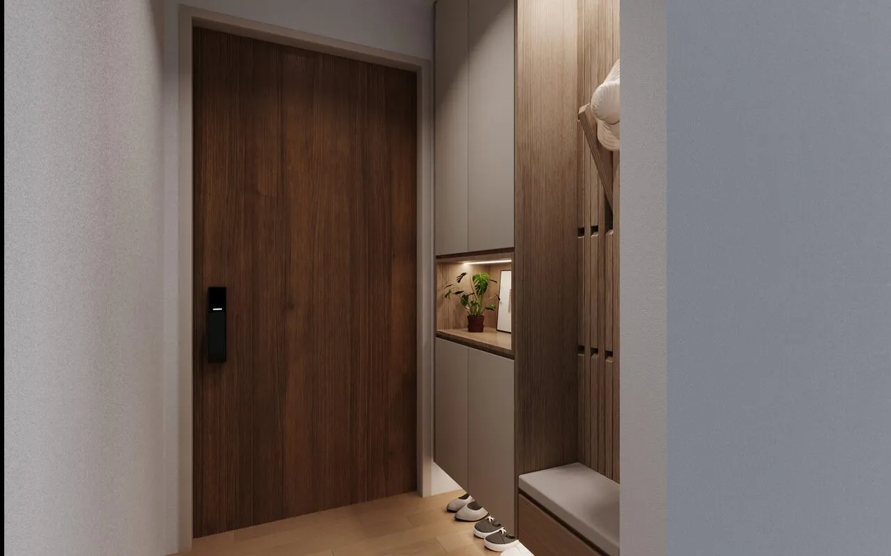
Varying shades of a single colour. Think a living room in four tones of warm grey — from charcoal ceiling beams to dove grey walls to pale grey linen sofas. This creates depth without colour clash.
Colours for Malaysian Homes — Our Recommendations
- Living room: Warm white or off-white base + one earthy accent wall
- Master bedroom: Muted sage, warm taupe, or deep ocean blue for rest
- Kitchen: Light neutrals for cabinets; let the backsplash carry the personality
- Study / home office: Darker, richer tones (navy, forest green, charcoal) to signal focus
The Most Common Mistake
Choosing your wall colour last. Always start with the fixed elements — flooring, furniture, significant artworks — and build your palette around them. The wall is the most flexible element in the room. Let it respond to what already exists, not the other way around.
Take our Design DNA Quiz to discover which colour palette matches your personality. See how we apply colour theory in real homes — browse our completed projects. Our interior design services include full colour and material consultation for every project. Pair this guide with our 2026 interior design trends Malaysia article for the latest palette directions.